
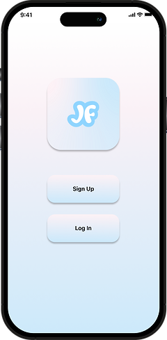
JustFitness
Welcome to JustFitness! This app is designed to help users keep track of their caloric burn and intake, while also allowing users spaces to share workouts and recipes with other users. Please follow along as I break down the process of creating this application.

Overview
JustFitness was created with the idea in mind that users want to track their workout routines as well as their eating habits. Functionalities have been expanded to include a Community Page where users can share their recipes and workout routines in order to curate the perfect regimine to achieve their individual goals.
Role:
Responsibilities:
Sole Researcher/ Designer
Discovery and Research, Information Architecture, and Prototyping
Audience:
Timeline:
People who are new to fitness and those with experience who want to share
4 weeks
Problem
Common issues with fitness apps include: gated content, lack of macronutrient information, workout and recipe tracking, or any combination of these problems.
Solution
JustFitness is designed to help users quell their problems with gated services and confusing UI. JustFitness is a community based fitness app that strives to open up accessibility to healthy habits to all- without the need to unlock any gated content.


Design Process
Similar to other projects I've worked on, the diagram included above helped me ideate and execute the steps in creating JustFitness. Being able to visualize all steps between Discover and Deliver was helpful when starting the app.

User Survey
I sent out a survey to friends and family to help gather ideas about my forthcoming fitness app. The quantitative data gained from the survey was instrumental in creating the user persona.

Takeaways
-
Younger users don't typically care about tracking their macronutrients or calories.
-
Of the users that want to track calories, cost of the app isn't a concern.
-
Users want a way to discover new workouts without looking foolish for asking.
User Interviews

In an effort to further understand user behavior, I sat down with some potential users to discuss how their habits could be changed by a more customizable solution. Adriana Hance and I discussed the importance of a tracker for many healthy lifestyle aspects. The qualitative data from this interview would help finish off the creation of a user persona. View my notes on the conversation below.
User Persona
Using the data I got from surveys and interviews, I was able to craft a user persona, who I named Josh Stevenson. Like many users, Josh is a young adult who is just starting his fitness journey.


Information Architecture
Journey Map
My journey map is an example of how a user experience can turn into a narrative. This journey is focused around my user persona, Josh Stevenson. He is new to the workout circuit and wants to learn new workouts without harming himself. You can view the steps that he takes below within the table.

User Pain Points
-
Some backwards chevrons and close out X's didn't have any connection point, so users would be stuck on the screen without a way back to the home page.
-
Some links required for task completion were difficult to find.
-
The hamburger menu wasn't attached to any instances, therefore making it's purpose on the page moot.
-
Users would benefit by having a floating CTA button for adding workouts or recipes to the app.
Paper Prototype

These drop down menus would let users customize their workouts that they built in the app or downloaded from the Community Page.
Scrollable slider for saved recipes.
The daily tracker on top of the page lets users add their snacks, meals, and workouts to have an updated calorie count.
Differentiates JustFitness from competing apps, and creates open collaboration between users.
Wireframe

Here's a realized version of the daily tracker. This will be used to help users keep track of their calorie goals. Not shown is a subtraction box for any workout done by the user.
Here's where the saved workouts will be contained. Users will be able to put workouts into routines like songs into playlists.
This is the floating CTA button that would be used to help users add their workouts or recipes to the Community page, daily tracker, or saved folders.

Style Tile
Here is an asset that contains all design theory for the project. Including Brand Personality, Moodboard, Logo, Color Pallette, and Typography.


Sketches
-
Home Page
-
Users will be able to navigate to various pages.
-
-
Community Page
-
Users will be able to interact with each other by sharing recipes and workouts.
-
-
My Workouts
-
An area where users can store their saved workouts.
-
-
My Recipes
-
An area where user can store their saved recipes.
-
This image is the preliminary sketch that launched JustFitness. You can see the similarities that persist throughout different stages of development.
Low-Fidelity Prototype
Below is the low-fidelity prototype for JustFitness. As you can already tell, I was experimenting with color pretty early. This scheme didn't fit, so I moved on to the current version that you will see later on the high-fidelity prototype.

Iterations of Design
(Before Usability Testing)
Non-clickable X
Here is an example of an oversight I had while designing the high-fidelity prototype. In the red circle located in the image to the right, there is an X. The X is used to exit the pop-up menu, and return to the recipe page. However, I forgot to connect the X to any interaction, so there was nothing to click. The user would be stuck on this screen and would have to restart the prototype in order to view a different screen.


Useless Hamburger
This hamburger menu would be a great place to store all clickable links. It'd be a really convenient spot for users to be able to access any page on the app without having to navigate there through the UI. Wouldn't that be a really nice and intuitive way to use a hamburger menu? I forgot to make it.
I completely spaced out and forgot to design the hamburger menu.
It's an essential instance of iteration that needed to be prioritized.

Usability Testing
Testing is important to the iteration process because it gets fresh eyes onto your project. A sole designer can get lost in the work unless they're checked by others. Usability Testing on my prototype helped make sure everything was running smoothly. The points below detail out my process of setting Usability Testing.
1. Script Writing
-
Started with consent form for audio/video recording
-
Listed all instructions for testing the prototype
-
Listed general questions to be asked before testing the prototype
-
Directed an initial screen tour to get first impressions of the build
-
Created a list of Tasks the tester will be asked to complete
-
Wrapped up the meeting with an offer to follow-up.
2. Questions
-
What phone do you use?
-
Which fitness apps do you use?
-
Which features do you enjoy the most?
-
Do you track calories and/or macronutrients?
-
How do you find out about new workout routines?
3. Tasks
-
Save a meal in the My Recipes section on the app.
-
Save a recipe to the calorie tracker.
-
Save a recipe from the Community Page.
-
Upload a workout to the Community Page.
-
Save a new workout from the Community Page
4. Wrapping Up
-
Any questions for me?
-
Ensure the exchange of contact information.
-
Introduce the idea of a follow-up.
-
How do you find out about new workout routines?
Feedback
Goal: Please navigate to the community page and download a workout routine.
Users had no issue with finding the Community Page but did have issues with some buttons on the page; some of the buttons did not work, and others did not have big enough click boxes.
Goal: Upload a recipe to the Community Page.
Users had more of an issue with this prompt than the others. The buttons weren't working and the flow to get to the upload page is a bit confusing and hard to find.
-
Hovering animations are not usable on mobile

-
Shapes with rounded edges and sharp edges compete for visual dominance.
-
Hamburger menu has no function.
-
Pages can look busy
-
Some scrollable items don't scroll

A/B Testing
One of the biggest struggles I had while working on the project was what to do with the color scheme. I settled on what is shown in the Style Tile, but I had a few iterations that I was considering before making the final decision.
Version A

Version B
Version B was selected by testers for the following reasons:
-
If users have an optical disability, the difference between the buttons and the background wasn't discernible in Version A.
-
Users tend to like the warmer color for the app, made it feel more inviting.
-
Although testers generally liked the pastel colors in either design, the ones in Version A were just a bit too light.
High Fidelity Prototype
Located below is the link to the JustFitness prototype. Feel free to take a look!

Takeaways
I learned a lot during this sprint. Although the pieces are here to make a well balanced app, I wouldn't mind having more time to iron out certain aspects of design. I found myself overworking on some items, but I had to move on at some point. I definitely learned that I need to set the amount of time that I'm willing to work on an item- for the sake of the rest of the project, I can't give all my time to few items. If I had more time, I would've experimented a little more with some other ideas.
I will continue to work on this app after the class is over, and make additional changes that I haven't had time to implement. I want to change the color scheme and some box designs. I've also reviewed some additional apps and have more ideas for cleaner design work. I'll take these lessons with me as I reiterate my apps and portfolio.
